top of page
Client
Banco LAFISE is part of Grupo LAFISE and Latin American Financial Services (LAFISE), is a financial institution providing banking services to clients in Central America and the Caribbean. With headquarters in Miami, FL, Banco LAFISE supports 160 branches offices in Nicaragua, Honduras, Panama, Costa Rica, and the Dominican Republic. Its range of services includes commercial banking, corporate finance, capital markets, and foreign exchange.
Product
Bancanet App is Banco LAFISE's banking app. It provides fast access to transfers, inquiries, payments, and more. The App supports users in Nicaragua, Panama, Costa Rica, Honduras, and the Dominican Republic.
Project Objective
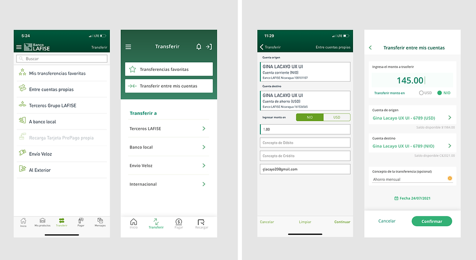
Improve the money transfer experience. Propose a UX/UI and Visual redesign for three transfer flows: to your own accounts, to other LAFISE users, and to accounts in other banks.
Problem
The App is too hard to use.


Project Constraints
-
App hasn't been updated in three years.
-
App redesign can't be revolutionary; it must be evolutionary.
-
App redesign will be divided into three phases. Phase one should not include changes to the code and logic.
My role
Lead and solo designer— discovery, user research, design, prototyping, testing.
Teams involved
LAFISE's Team (Design and content)
InfoCorp Team (Engineer and developer)
MY GOALS
-
Advocate and evangelize for User Experience and User-Centered Design.
-
Provide an easy workflow for a complicated operation by updating the content, organization, UX, UI elements, and Visual Design.
-
Create a precise and predictable flow.
-
Reduce the number of input fields on every screen.
-
Create a visual hierarchy with color and text.
Before
After
Before
After
Before
After
Before
After
Before & After

Before
After
Before
After

Before
After
Before
After

Before
After
Before
After

Before
After
Research
An extensive study on our competitors showed me that Bancanet's design was the less user-friendly one. As a result, users were utterly frustrated with the App, compared it with their main competitor, and only continued to use it because there was no other option. Through user interviews and surveys, it became evident that there were massive pain points in Bancanet.
-
There is no rationale, design standard, or coherence in how Bancanet operates across the website and native App.
-
There is an overload of content without visual hierarchy and information architecture to support it.
-
There are no UI elements to guide the experience.
-
Language is too technical.
-
Content does not consider user needs; it considers the institution's outdated laws and regulations and requires too much legal information.
-
There is no understanding of the user and their needs.
-
The App is not accessible: small text, low contrast.
-
There is no guidance, notifications, alert messages, and other helpful conversation during the processes.
-
The options offered are hard to understand.
-
There are lots of functionality that aren't relevant or valuable for the average user; some don't even work.
-
Error messages are confusing; they don't identify the error.
-
It is too hard, almost impossible, to add a new recipient.
-
Too many users are enrolled as payroll by companies; they don't have unique users and can't use many functions of the App, making their experience poor and frustrating.
Most performed tasks in-app
-
Transferencias A Terceros - 48.5%
-
Pago De Servicios- 17.9%
-
Transferencias En El País- 17.5%
-
Transferencias Entre Cuentas Propias - 11%
-
Pago De Tarjetas - 2.6%
-
Envío Veloz - 0.6%
-
Recarga De Tarjeta Prepago - 0.5%
-
Recarga De Tarjeta Prepago De Terceros 0.3%
• Currently, the order of options offered to the user does not correspond with the findings.
Sitemap - Before & After
Before

After

Design opportunities
Historically, the product was updated by the developers. There was no existing information architecture, so I created my sitemap of the transfer flow as it was and used it to expose the main pain point during our client developers and design team meetings. By the way, I love organizing information; the process brings good insight into the structure.
There were a lot of general design principles that would strengthen the App and provided design and growth opportunities for the team:
-
Taxonomy, Hierarchy, Organization
-
Accessibility
-
User-centered design
-
Simple, coherent, relatable vocabulary based on the user profile.
-
Notifications, onboarding flows, and information boxes.
-
Streamline and automated process led by data.
-
Intelligent program
-
Enroll payroll users to grow a unique users database.
-
Create an in-house developer/engineer team to implement and iterate promptly.
Exploration and Iteration
Initially, I explored the many different ways a user would make a transfer and create a new recipient from the App, mobile web, and desktop. I also explored other banks and FinTech Apps transfer flows. As part of my process, I detailed every flow and weighed the pros and cons of each.
The biggest problem was on adding a new recipient. As it stands, the app stores recipients based on the type of transfer, and there are 5+ types of transfer. The same user can exist as a unique user under every vertical. And one can only create a recipient during a specific transfer flow.
Although the most intuitive way to do this was to add the recipient at the beginning of the process, this would change the App's logic, impacting time and budget. I resorted to creating two flows, one for making a transfer and adding a new recipient. They are independent and connect if the user wants to.
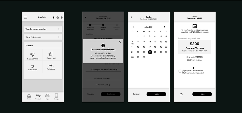
Wireframes


Final Product - Screens


Outcome
With a new in-depth knowledge of Financial vocabulary, needs, and regulations, plus a redefined storyline and use cases, I created the sitemaps, wireframes, and prototypes, which later evolved into high fidelity screens.
It was a fascinating project. It provides real value, involves extensive research and organization, and detailed interaction work. Though the constraints around development, time, and budget allowed only phase one implementation, I proposed a road map to phase two and a clear idea for the new design, logic, and data handling for the project's upcoming phases.
I learned some important takeaways from this project related to product and business processes.
-
Adapt to changing requirements
-
Negotiate with developers in favor of the clients' needs.
-
Advocate, evangelize and always fight for good UX
-
Workaround strict technical constraints and still deliver the best user experience.
-
Choosing what we won't do and bringing the client onboard with that decision.
Interactive Prototype


bottom of page


